
How to Use Visual Hierarchy in Your Data Stories
“One Chart, One Insight: A Monday Data Story Hack”

Welcome to The Hook — Monday Edition.
Every Monday, we take a boring dataset and turn it into a story. Plus, 2 quick data storytelling tips to use at work this week.
Before & After: The Power of Visual Hierarchy
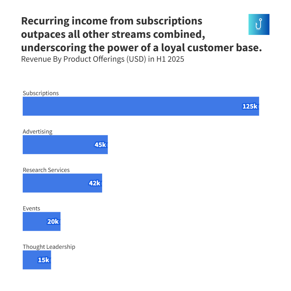
Before:
You’ve created a bar chart comparing revenue by product offerings for a media brand. Everything’s in the same color, font, and weight. It looks tidy, you even added an interesting title revealing the key insight, but nothing pops.
After (story chart):📊 You highlight one bar — say, “Recurring income from subscriptions outpaces all other streams combined, underscoring the power of a loyal customer base.’
Suddenly, the chart grabs your audience’s attention.
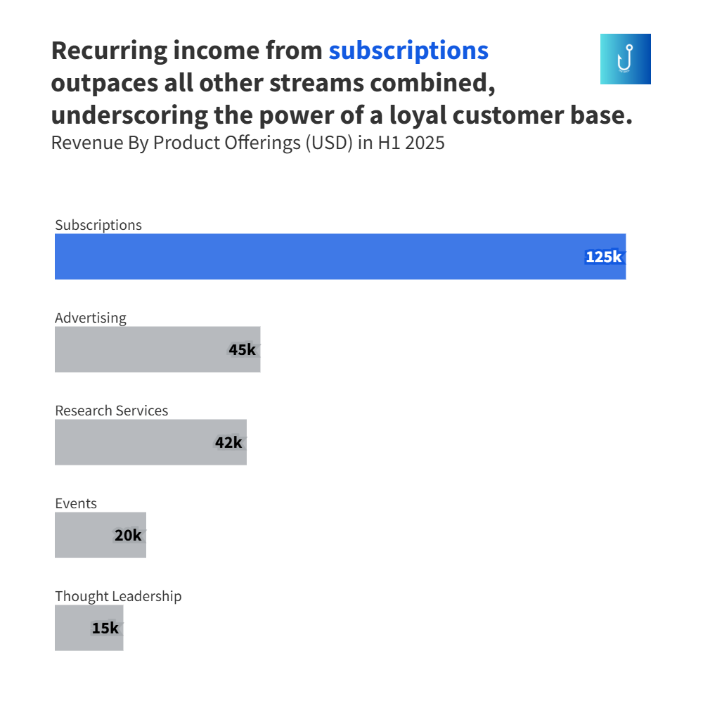
👉 Lesson: The human eye is wired to look for differences before it looks for data.
2 Data Story Tips for the Week
1. Use color as hierarchy, not decoration.
Instead of a rainbow palette, pick one accent color that marks your insight. This could be the outlier, the spike, or the turning point.
Keep everything else neutral.
2. Apply the “Reading Path” Test.
Show your chart to someone for 3 seconds.
Ask: “What did you notice first?”
If they didn’t name your key insight, your hierarchy failed.
Viz Finds of the Week
💡 Use this hack in your meetings, presentations, and reports this week. Take one raw dataset, highlight the most important difference using visual hierarchy, and make it stick
See you on Friday for a deep dive into culture, sports, and the economy through data.
Want your team to tell better stories? Send an email to mobolajiadeb@gmail.com to book a data storytelling workshop.
Want to tell better data stories—whether in meetings, content, or reports? Book a 1-on-1 session and learn how to turn numbers into narratives that stick.
Please forward this email to one friend who loves data or good stories.